Mapping
Meet the B.C. software developer who wants to bring back the globe
Inside the campaign to make the Earth spherical again
- 730 words
- 3 minutes
Mapping
Canadian Geographic’s cartographer shares his thoughts on how map projections shape our view of the world
Cartography is having a moment. First came U.S. President Donald Trump’s clumsy and ire-inspiring attempt to rename Lake Ontario to “Lake America.” Then, more consequentially — though with less fanfare and press coverage — the United Nations adopted a resolution encouraging a shift away from global maps that misrepresent the relative sizes of different countries around the world.
Titled “Correct the map:” rebalancing global cartographic representation and promoting equitable representation of the world’s regions, particularly Africa,” the resolution, brought forward by the Togolese Republic, was adopted by a vote of 163 to one with six abstentions. It will come as no surprise that the United States was the single opposing vote, reflecting the current administration’s apparent aspiration to look bigger on maps.
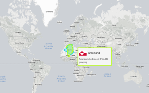
The resolution takes particular aim at the Mercator map projection, the poster child for a distorted representation of our planet. A map using this projection increasingly swells the land and ocean the further you go from the equator, to the point that Greenland looks about the same size as Africa, even though its actual area is 14 times smaller.
The influence of this inconsistent scaling on people’s mental maps of the world is difficult to know, and studies have not shown conclusive evidence that it causes quantifiable misunderstanding. But as a cartographer, it has always been my conviction that maps work best when they compare apples to apples. When different parts of a single map are built on different assumptions, different methodologies or different scales, the one-to-one spatial and relational patterns people intuitively look for are distorted and ultimately misleading.
All maps are distortions and abstractions of reality. You can’t render our planet’s three-dimensional spherical surface onto a two-dimensional flat plane without distorting it. And while small distortions occur even in more local maps (say, of a town or a province), at the scale of the Earth, distortions in all spatial properties (size, form, distance and direction) are at their most severe.
Different map projections use different mathematics to transform (or project) our spherical home onto the plane of a sheet of paper or computer screen. Some strive to maintain local shapes and angles (conformal), some aim to maintain true distances between particular locations (equidistant) and some aspire to maintain the true relative size of all parts of the map (equal area). None can achieve all of these aims at once.
Any good cartographer knows that there is no “ideal” map of the world (or of any place, for that matter). Instead, cartographers recognize that good maps are fit for purpose. When charged with making a map, the map-maker must ask, what do we want this map to say? What is the story we want to tell, the impression we want to leave? Answers to these questions guide the long list of choices that must be made, from which map projection to use to what layers of information to include to how to style and design the map.
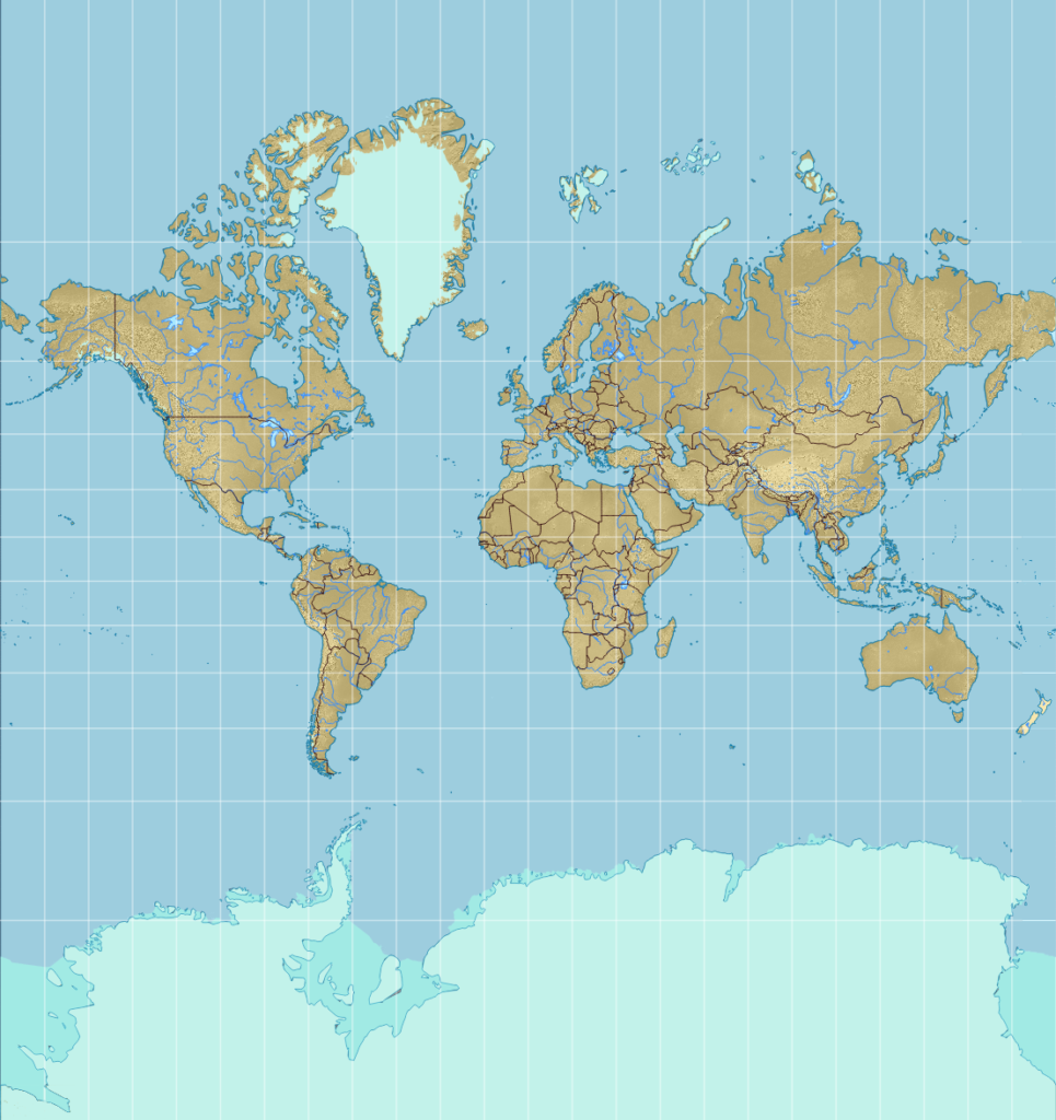
The Mercator projection was designed for ocean navigation more than 450 years ago. Its most useful quality is that mariners could obtain a compass bearing from one place to another simply by drawing a straight line on the map. It remains common on paper maps, likely as an under-questioned habit from these early days. Why Mercator’s digital cousin, the Web Mercator projection, is common online today is a little less clear. No one is drawing straight lines on Google Maps to get a compass bearing from one place to another, and digital map software calculates distance and direction independent of map projections, so there’s no real navigational value to using this projection. Mercator does possess the functional quality of straight horizontal edges, which allows the arbitrary “edge” of the map between Russian and Alaska to be stitched back together seamlessly so that a user never hits the “end of the world.”
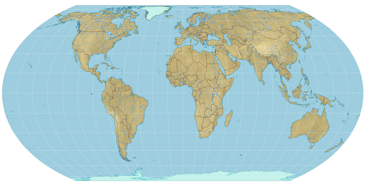
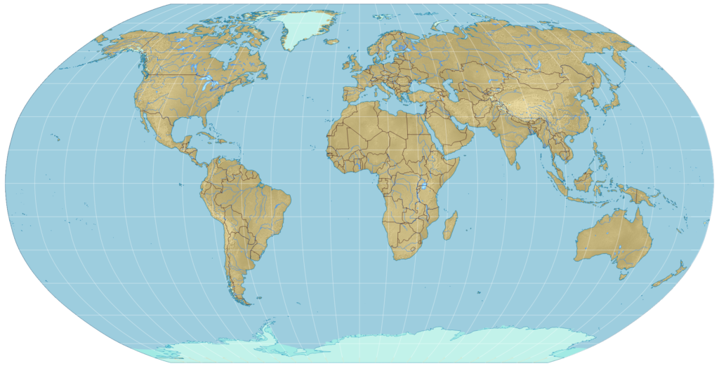
The purpose (or story) of the Equal Earth projection promoted by the UN resolution is in its name: to represent all parts of the planet in equal and comparable proportion. It was created in 2018 by the team of Bojan Šavrič, Bernhard Jenny and renowned American cartographer Tom Patterson. It was modelled after the Robinson projection, designed by Arthur H. Robinson for the Rand McNally company in 1963 and routinely used by Canadian Geographic and other major map producers. The Robinson projection is not equal area, but because the shapes of the continents and countries on a Robinson map look a great deal like they do when looking at a globe, this map just “feels” right — at least, it does to anyone steeped in continental form.
Some of this “right feel” has been lost in the Equal Earth projection, as Canada and Russia become profoundly “squished” at the top. But given the UN’s focus on equity and representing data in globally comparable ways, the Equal Earth projection tells the right story. Distorted maps contribute to a distorted vision of the world in which the global north in particular appears bigger than it actually is. This cartographic worldview has real “cognitive, educational, cultural, geopolitical and socioeconomic impacts,” particularly for people living in the global south. As Robert Dussey, the Togolese minister who introduced the resolution, said, “By adopting this resolution, we’re not just correcting a map, we are contributing to correcting our perception.”
Mapping
Inside the campaign to make the Earth spherical again
Mapping
Canadian Geographic's cartographer Chris Brackley shares insights into his process in charting the country's largest islands for an exclusive wall map

Mapping
Maps have long played a critical role in video games, whether as the main user interface, a reference guide, or both. As games become more sophisticated, so too does the cartography that underpins them.
Mapping
The True Size map lets users compare countries by their actual size in square kilometres