Science & Tech
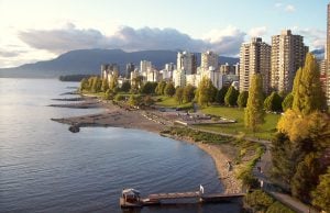
How Canada is preparing for the next big earthquake
The last megathrust earthquake to strike Canada was in 1700, and the clock is ticking. How we’re preparing for the impact.
- 2809 words
- 12 minutes
This article is over 5 years old and may contain outdated information.
Mapping
The True Size map lets users compare countries by their actual size in square kilometres


Are you sitting down? The world map you’re probably most familiar with has been misleading you in a subtle but important way: many land masses appear either smaller or larger than they actually are.
Fortunately, a new online map, The True Size Of, is here to set the record straight. The interactive map allows users to search for a country and then compare its actual surface area against a Mercator projection map, one of the most popular and yet most inaccurate maps of our world.
The problem is that to portray our spherical globe in two-dimensional form, cartographers have to use a “projection,” which converts lines of latitude and longitude into locations on a plane. All projections cause some distortion, but the Mercator projection is particularly egregious, exaggerating the size of land masses near the poles, while shrinking land masses near the equator.
For example, Greenland is usually portrayed as roughly the same size as the continent of Africa, but its actual surface area is about 2.1 million square kilometres — less than the African country of Algeria. Conversely, Brazil — the fifth-largest country in the world by surface area — appears to be the same size as the state of Alaska, but as the screenshots below demonstrate, the reality is wildly different.
James Talmage and Damon Maneice, creators of The True Size Of, say they hope geography teachers will use the map to show their students how big the world really is.

Science & Tech
The last megathrust earthquake to strike Canada was in 1700, and the clock is ticking. How we’re preparing for the impact.

Mapping
Maps have long played a critical role in video games, whether as the main user interface, a reference guide, or both. As games become more sophisticated, so too does the cartography that underpins them.
Mapping
Canadian Geographic cartographer Chris Brackley continues his exploration of how the world is charting the COVID-19 pandemic, this time looking at how artistic choices inform our reactions to different maps
Mapping
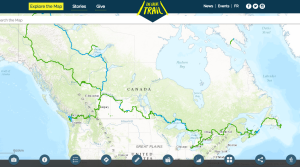
As Canada's most famous trail celebrates its near completion, Esri Canada president Alex Miller discusses the ambitious trail map that is helping Canadians get outdoors