
Science & Tech
Finding a whale in a watery haystack
Satellite detection of whales is improving rapidly, but finding the behemoth creatures is still surprisingly tricky
- 964 words
- 4 minutes
This article is over 5 years old and may contain outdated information.
Mapping
Chris Brackley explores four map backgrounds and makes the cartographic case for why satellite imagery isn’t as useful in mapmaking as you may think it is.

Maps are all about relationships. How close is this city to the ocean? How many roads traverse that mountain pass, and where? Even the simplest maps tell us a relational story.
Here, I will explore four map backgrounds and make the cartographic case for why satellite imagery isn’t as useful in mapmaking as you may think it is. For the purposes of this post, I have stripped off the roads, town names and landmark identifiers that would usually be in the foreground of these maps, leaving only imagery, land cover, etc.
Consider this typical “locator” map showing the shape of the continent, the extent of different countries and the name of a single Canadian city. This map tells us how big the USA is relative to Canada and how close this particular town is from the ocean and from the United States. At its core, geography is about how things relate to other things on a landscape scale.

This map is what I would call a shallow map. It’s pretty thin on content, and thus pretty thin on “ah-ha” moments. On the other hand, a deep map does not have information deserts (for example: single colours saying nothing except “Canada” or “ocean”). It has a background that gives context to the information in the foreground.
Maps with depth use every pixel to describe something about that particular part of the Earth’s surface. There was certainly a time when this kind of data simply didn’t exist. Charted territory was restricted to towns and rivers and shorelines. The first real data set to be created that (at least by inference or extrapolation) covered every square inch of land on continental scales was contour line data representing elevation. This occurred in the early 1900s thanks to air-photo interpretation techniques developed over the course of WWI.
If you look at atlases from the 1920s forward, you’ll begin to see the proliferation of this first class of “deep” maps. They used “hypsometric tinting” to describe elevation at every point on the land area of a map; hypsometric tinting simply being continuous or discrete colouration based on height above sea level.

This cartographic technique is so ubiquitous it should be utterly familiar to anyone who has ever opened an atlas. The colours used have become standardized over the years with greens in lower elevations, blending to browns in mid-elevations and eventually to grays and whites at the highest elevations. Of course there is a real-life tie in here: lush, life-filled landscapes at lower elevations (greens), sparser and rockier environments as we climb higher in elevation (browns) and into barren lands (gray) and snow capped mountains (white).
But there’s a potential pitfall with this generalization. Do we find greenness in deserts that occur at low elevations? Do we find greyness in a high alpine meadow? Maybe, but in these instances ¬— probably not. So while an interesting relational story can be told with hypsometric-tinted maps (this road goes over a high mountain, or this land with few lakes is very flat), it is not necessarily a story that relates most closely to our human experience of landscape, and as such isn’t always the best choice as a background for most maps.
Even if we consider elevation on it’s own merits (regardless of how we colour it), unless we’re in the mountains, we don’t really define our experience of place in terms of elevation. Our experience of place is far more defined by the environments we find at different elevations. Prairie vs. forest vs. city. These definitions (or to use a map term “land cover data classes”) are how we experience the world. But how to represent them on a map? These days the default approach is to use a satellite image. After all — this is a photo of what is actually there at any given place on the planet.

Perhaps no satellite image is more common than the beautiful satellite mosaic created by NASA shown here. This certainly goes a long way toward telling us what we’d find if we went to a particular place on this map. Green (plants) vs. brown (deserts) vs. white (snow and ice) — all here, and all quite true to the colour palette you would experience if you were in any of these environments.
But as my teacher told me in my first cartography class “a satellite image is not a map”. This point can certainly be argued either way, but the point he was making was that a satellite image has not undergone the important cartographic process of classification and symbolization.
I agree that maps are best when all elements shown have been classed into categories that can be described clearly and understandably. Though there are challenges in applying this process at a continental landscape: where exactly does the city end and the farmland begin? Is this area a wetland or a forest? We get a much clearer graphic communication when the reader of our map knows what every pixel on the map is meant to represent.

This map shows North America parsed into distinct landcover classes. Different classes are coloured to be distinct from one another, as well as evocative of the places they represent. Shades of green for different forest types (bluer green for evergreens and wetlands, yellower greens for deciduous forests), yellows for agricultural lands (evoking dried grasses), orange/browns for desert landscapes, etc.
While these colours will not be completely true of every place they’re meant to represent, the most important aspect of classing land cover is to make clear (with use of the legend) the specific kind of environment one would find at any place on the map. Cities pop on this map, the agricultural lands are distinguished from surrounding forests.
As for the ocean, which is often largely ignored on most maps, elevation (or in this case depth—also know as bathymetry) is actually the most intuitive way to understand the marine environment. Ocean depth is the best single indicator of the kind of environment one might find in a given part of the ocean, and so seems a good analogue for land cover.
As I said to begin this post — maps are by definition relational, and a truly deep map is one that shows a river passing not through an infinite sea of yellow background, or an undefined series of textures and colours, but instead through clearly defined mosaic of cities, forests, deserts, etc. And while I continue to see far more maps with hypsometric tinting or satellite imagery as their contexts, my hope is to see the rise of landcover as the new background of choice for mapmakers.
Chris Brackley is Canadian Geographic’s resident cartographer. A version of this article originally appeared on his website As The Crow Flies Cartography. It has been republished here with his permission.
Science & Tech
Satellite detection of whales is improving rapidly, but finding the behemoth creatures is still surprisingly tricky

Mapping
Maps have long played a critical role in video games, whether as the main user interface, a reference guide, or both. As games become more sophisticated, so too does the cartography that underpins them.

Mapping
Terrapattern uses satellite imagery and pattern recognition to identify specific visual features of an area
Mapping
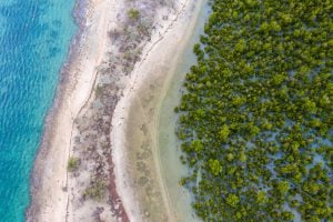
Mangroves provide a range of benefits, including protection from storms and the prevention of coastal erosion