Liam McGuire has always been fascinated by cities. From towering downtown skyscrapers stretching to the clouds, all the way out to the suburbs, the geography researcher is interested in how cities are structured — and why they are structured the way they are.
“Who lives in which parts of the city?” he wonders, “and why do they live there?” So, he did what any sensible geographer might do — he made a map.
What started off as his master’s thesis on the city of Toronto turned into the Ten Cities Project as McGuire sought to more deeply understand Canada’s cities, starting with Toronto and moving onto Ottawa. Canadian Geographic spoke with McGuire on what motivated his research, how the map came together and what he hopes people will take away from this work.
On how this project started
I think looking at cities is a fascinating way to understand our society: how it’s structured, why it’s structured. So when I went off for graduate school, I guess about seven, eight, nine years ago now, I ended up studying urban geography at the University of British Columbia. It seemed a natural fit to try and use some quantitative methods to try to map out cities and understand how inequality shaped cities and how you could understand that by looking at it on a map
I ended up settling on Toronto as a research site just because it’s such a huge, huge metropolitan region and has so many patterns, so many different types of trends throughout the region. It was also a return home for me. I was born in Toronto and moved away at a young age. I’ve always been fascinated with the city; I’ve travelled there throughout my life and I’ve always just been so intrigued by how diverse it is in terms of the built form — everywhere from the massive skyscrapers all the way out to the suburbs. So I think one of the main drawing features was just the questions of: what creates those divisions? What might be behind it? Who lives in what parts of the city and why do they live there?
On answering these questions
It was kind of a two-part process. I looked at what people had done before in terms of trying to understand cities through data. A lot of the time an analysis will use one variable — one way of looking at or understanding a city such as income, housing, race, education, etc — and try to interpret the city through that one lens. But what I wanted to do was to try and use a multivariate lens to understand the city through multiple ways with one single map. So I ended up doing a cluster analysis: I took all of these patterns and instead of just looking at one variable, I looked at how all of these things relate to each other.
This analysis told me that some parts of the city have a unique pattern, whether it’s areas with apartment housing and mainly new Canadians arrived within the past five to 10 years, versus areas with a higher percentage of individuals with a college education, working in the service sector and who are renters who struggle to pay rent month to month, versus another area that might look quite different.
The second way that I tried to understand the city was I actually spent a few weeks walking around the suburbs of Toronto to try and just be there and get an understanding of how the neighbourhoods had been.
On the importance of “ground truthing”
I think it’s really important that we study places that we’re able to be familiar with, so that we understand the implications of our research and we don’t allow the numbers to tell a story that isn’t necessarily true or that maybe is missing a big piece. Sometimes you have to actually see with your own eyes and “ground truth”, just to make sure that it is accurate.
It’s one of the reasons I chose Ottawa as the second site when I decided to re-do all of the Toronto data with the most recent census data. I did still want to keep Toronto because I had measured it in the past and I was interested to see what had changed. But I also did want to add on Ottawa, because this is where I am now. It’s the city I’ve grown up in, it’s a city that has certainly shaped me and a lot of my interest in urban geography. And it’s a city full of neighbourhoods that I know well. So I knew that by also studying Ottawa I could make sure that I could give context to what I was seeing and make sure that was shaping the analysis, too.
On the changing city
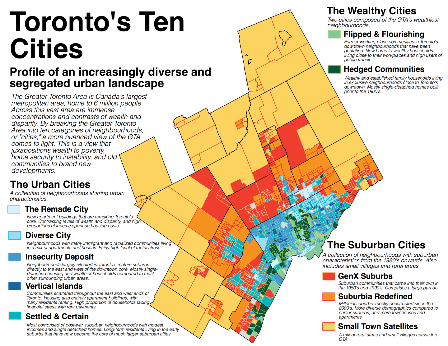
The main thing that I really started seeing was the continued divide along the lines of wealth — and what that looks like in the city. A lot of this research was initially influenced by a researcher called J. David Hulchansky, who wrote a report called The Three Cities Within Toronto. The report talked about three different parts of Toronto that were rapidly dividing from each other: one part of Toronto that was getting wealthier and wealthier and more and more exclusive; another part of Toronto that had a lot of residents who were continually struggling to meet rent or find an affordable to live; and that shrinking middle, the middle class who were diminishing in numbers. And when I looked at my most recent map, you can see an increasing divide between really wealthy homeowners living in the city and people who are struggling to make rent every month living in apartment buildings surrounding the core.
I think one specific trend that really came up was this one group of neighbourhoods that were formerly working class neighbourhoods. You can think of Cabbagetown, for example, in Toronto, which formerly were middle-class and working-class neighbourhoods, but are very close to public transit along the subway lines, which are really desirable these days. And those neighbourhoods have essentially been flipped and have kind of been priced out. So I think that’s representative of something that’s going on in terms of housing affordability. And of course, when you look at the socio-demographic profile of that neighbourhood, it is largely white, it’s largely university educated homeowners. So I think it just shows some of the growing inequality along lines of income, but also housing, race, education and a number of other factors as well.
On how seeing cities like this can inform future policy conversations
When I look at this map, I think about all the conversations that have taken off in the last few months about equality. There’s one “city” in Toronto I called Hedged Communities and it’s got 81% homeowners, an average household income of over $175,000 a year. Almost 70 per cent of people living in single households with an average value of $1.3 million, and it’s 79% percent white. But when you look at the cities I’ve called Vertical Islands, just a few kilometers to the east and west, only about a third of the people there are homeowners, but 90 percent live in row houses or apartment buildings. It’s got an average household income of just under $52,000, 60 percent are immigrants and 75 percent are racialized. So I think it’s a stark contrast. And my hope is that it supports a conversation about inequality not just being about income inequality: it’s about race, it’s about education, it’s about access to housing. When we look at this map of the city, we’re seeing a systematic ordering of the city deciding who can live where. And I think the next conversation that would follow this would be a conversation about how policy and planning decisions are decisions made, and how do these planning and policy decisions impact the ordering of the city and deciding who gets to live where?
On what he hopes people take away from the map
I hope everyone can relate to the map if they lived in Toronto or Ottawa at some point in their lives — or even in their own cities, they can see a similar pattern of, as I call them, “cities” or clusters of neighbourhoods that represent a place that they’ve seen “flipped” as well. I hope people can relate this to their own experience of living in a city. And I hope that I’ve tried to make the research as accessible as possible so that if someone has a certain question they want to answer, or a trend they want to look at, maybe this can be a springboard to start other conversations. The Greater Toronto Area is a humongous metropolitan region. So I’m hoping that there are lots of stories contained within the data that can help to spark further conversations.
On the potential of expanding the project to other cities
I did this all on my weekends and evenings over a number of years. I find this work extremely interesting and I would love to do more cities in the future. I certainly might take that on, of course, just if ever time allows. But I certainly would love to see what this would look like compared to a city like Montreal or Vancouver. I think it would raise a really interesting conversation about what similarities are there between, say, Montreal and Toronto and how do those similarities and differences speak to what decisions have been made in the past.
With that said, I think that if you looked at a number of other cities across Canada, I think you would still see the inequalities along the lines of housing and racialized populations and education and labor. I think you would just see it manifest in different ways. But I think, by and large, all major Canadian cities are going through the same process of growing inequality. And I think it’s really important to understand that, and create research-informed policies that have a strong equity focus to make our cities a bit more of a liveable place. Because if this trend certainly keeps going, it is going to create a much, much more unequal climate for people living here.
I think no matter where I go next, I just have a strong passion for trying to analyze trends within the city and, specifically, trying to understand these trends to inform a future for our cities that have a more equitable outcome than the current trend we’re heading towards.


