This article is over 5 years old and may contain outdated information.

Mapping

Interactive map shows global population growth through time

Interactive map/timeline combo shines light on global population trends between 1 C.E. to present, as well as the historical milestones that accompany them
  • Mar 27, 2016
  • 311 words
  • 2 minutes
World Population: An Interactive Experience map and timeline. (Map: Population Connection)
Expand Image
Advertisement

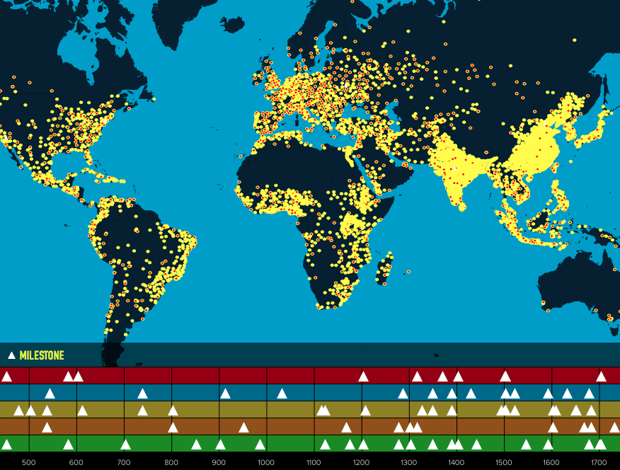
Over the last two thousand years the human population has grown from 170 million to 7.4 billion people. By the year 2100, the population will likely reach 10 billion – a number that some posit will place unsustainable stress on the world’s available resources.

People can now explore the world’s exponential growth through time with World Population: An Interactive Experience – a map/timeline combo that shines light on global population trends between 1 C.E. to present, as well as the historical milestones that accompany them.

Each dot on the map represents one million people, and each milestone is organized into five themes: Food and Agriculture; Health; Science and Technology; Environment; People and Society.

As you scroll through the timeline, population dots and milestones appear and disappear on the map, with bonus descriptions popping up when you click on each icon.

For example, when the Black Death struck Europe in the middle of the 14th century, up to 50 per cent of continent’s population fell victim to the fast-moving and virulent plague. On the map, the outbreak manifests itself in the sudden reduction of population dots.

In Canada, the population dots don’t start multiplying until around the Industrial Revolution, when the global scale tips over 1 billion people.

“The capacity of our environment to provide space, to produce food and to supply energy are all limited,” says Sal Vecchio, a TV editor known for his work on National Geographic documentaries, in a video that accompanies the map. “Slowing human population growth and lowering our use of natural resources are key to reducing the impact we have on the planet.”

The map was made by Population Connection, an American grassroots organization that advocates for population stabilization.

Advertisement

Are you passionate about Canadian geography?

You can support Canadian Geographic in 3 ways:

Related Content

The New York Times COVID-19 map

Mapping

Mapping COVID-19: How maps make us feel

Canadian Geographic cartographer Chris Brackley continues his exploration of how the world is charting the COVID-19 pandemic, this time looking at how artistic choices inform our reactions to different maps

  • 1145 words
  • 5 minutes
Assassin's Creed Odyssey landscape

Mapping

Inside the intricate world of video game cartography

Maps have long played a critical role in video games, whether as the main user interface, a reference guide, or both. As games become more sophisticated, so too does the cartography that underpins them. 

  • 2569 words
  • 11 minutes

People & Culture

The truth about polar bears

Depending on whom you ask, the North’s sentinel species is either on the edge of extinction or an environmental success story. An in-depth look at the complicated, contradictory and controversial science behind the sound bites

  • 4600 words
  • 19 minutes
The War of 1812 giant floor encourages students to interact with history

Kids

Giant floor maps put students on the map

Canadian Geographic Education’s series of giant floor maps gives students a colossal dose of cartography and is a powerful teaching tool

  • 1487 words
  • 6 minutes