Mapping
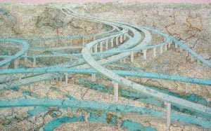
Creative Cartography: Matt Cusick’s map collages
This article is part of a series of Q&As with some of the best artists working with maps. Read…
- 1186 words
- 5 minutes
History
A map of Toronto in 1878 shows a small city on the brink of massive expansion.

As with all cartographic representations, what this map of 1878 Toronto doesn’t show is every bit as interesting as what it does. Perhaps more so.
According to an 1878 city directory, Toronto at the time had numerous newspapers, an extensive network of rowing, lacrosse and curling clubs, 36 real estate agents, a dental college, an Oddfellows lodge, four hoop skirt makers and three dance teachers. A man named James Authors made artificial limbs from a storefront on King Street, just east of Yonge. There was even a historical society, the York Pioneers, which, as it happens, still operates.
Indeed, the map’s historical moment is worth noting because it can be read as a point in time when the civic narrative begins to shift. For Torontonians of the 1870s, events like the War of 1812, the founding of the City of Toronto (1834) and the Upper Canada Rebellion (1837) existed on the very edge of living memory. Confederation, however, had occurred only a decade earlier, and the city was poised to reap the benefits associated with being a commercial hub in one of the British Empire’s first independent spin-offs.
But this map reveals none of this.
Published by printer bookseller Willing and Williamson, what it does show is a distillation of a much smaller city on the cusp of exponential growth.
At the time, the city didn’t extend west of Dufferin or east of the Don River. Toronto had a population of just over 80,000, with nine wards and a mayor named Angus Morrison, a lawyer and Orangeman who had also served as a federal politician. The waterfront still followed the original lakeshore. It was punctuated by wharves and edged by a single rail line — the Northern Grand Trunk. The corridor swoops in from the northwest and swoops out to the northeast, past Ashbridges Bay, the now heavily polluted wetland at the mouth of the Don River.
Also visible is the Garrison Creek ravine system, which empties into Lake Ontario at the Queen’s Wharf just east of Fort York, as well as the meandering course of the Don, which would later be straightened out to enable industrial shipping activity.
Most of the buildings depicted are churches, schools or institutional structures, although the map also shows several banks, theatres and the office of The Globe. In some cases, the descendants of these structures remain part of Toronto’s urban fabric. The “Lunatic Asylum” at the far left became, through several iterations, the Centre for Addiction and Mental Health; parts of the high brick walls of the old asylum have been preserved.
On the far right, the “New Gaol” became the Don Jail, a reform-minded penitentiary to replace the miserable old county prison that operated for several decades near today’s Distillery District. The Don Jail, of course, became a notoriously awful place: rundown and violent, and the site of Canada’s last execution. It finally closed in 2013. The restored building now serves as the administrative offices for a rehab hospital and a small museum.
A Union Station is visible on the lower part of the map, but it isn’t the muscular 1914 Beaux Arts structure that has become a city landmark. Indeed, the Union Station on this map, begun in 1872, was a block to the west. According to the City of Toronto’s website, it was modelled on the Illinois Central Station in Chicago and had three domed towers, one with a clock.
Just one year after the map was published, the provincial government began building an impressive new legislative assembly in Queen’s Park, on the grounds of the University of Toronto. Then, in 1883, Toronto council approved the first of several annexations — in this case, Yorkville — that allowed the city to expand east, west and north.
By the end of the 1880s, industrialization was rapidly transforming Toronto, with large manufacturers like Massey-Harris, Gooderham and Worts, and Consumers’ Gas erecting sprawling factories across the breadth of the waterfront. Extensive lake-filling created a bulging rail corridor, as well as new waterfront real estate for warehouses and foundries. The city’s population boom also began during the 1880s, with Toronto adding 100,000 people between 1878 and 1891. Just 40 years later, the population had quintupled, to over 500,000, thanks to mass migration, not just from the British Isles, but also from Italy, China and Eastern Europe.
To the Torontonians of the roaring 1920s, in fact, the adolescent colonial city depicted here must have also seemed impossibly remote — a quaint little place, shimmering at the edge of living memory, poised for the big things ahead.
This story is from the May/June 2022 Issue
Mapping
This article is part of a series of Q&As with some of the best artists working with maps. Read…

Kids
Canadian Geographic Education’s series of giant floor maps gives students a colossal dose of cartography and is a powerful teaching tool
Mapping
Art of Cartography exhibit at the Toronto Public Library features visually stunning maps from the 15th through the 19th centuries

Mapping
iPhone and Mac users across Canada will notice drastic changes to Apple Maps following a massive update pushed to devices yesterday