Kids
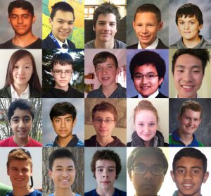
Meet the 2015 Canadian Geographic Challenge participants
The Canadian Geographic Challenge, now in its 20th anniversary year, will bring 20 young…
- 1691 words
- 7 minutes
Mapping

Tom Koch has several job titles, but he’s notably an adjunct professor of medical geography at the University of British Columbia and author of Cartographies of Disease: Maps, Mapping and Medicine. As an expert in disease mapping, Canadian Geographic spoke with him about the practice and what we can learn from past pandemics as the world grapples with how to contain the spread of the novel coronavirus, Covid-19.
On his introduction to disease mapping and medical geography
I was at the Hospital for Sick Children in Toronto working on graft protocols and I saw an article on the system of organ transplants. I thought there were some problems so I wrote a letter to the editor, saying there were certain things left out like ethnicity and income. The author wrote back a condescending note saying “You don’t know what you’re talking about,” so I ended up doing a map showing that the system wasn’t doing what it was supposed to be doing.
I started with mapping graft transplantation and ended up writing a dissertation and a book about it. Then at UBC, I said let’s do some interesting cases like the John Snow case of epidemiology [John Snow was a British physician who traced the source of an 1854 cholera outbreak in London — Ed.] and the salmonella outbreak here in Vancouver in 2000.
On early disease mapping
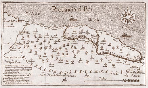
The earliest I’ve found was Arietta’s map of 1691 of a three-stage containment field in Italy. Finding that map and translating it was a revelation because this was a very complete system of quarantine introduced to try to slow the progress of plague in Italy.
Scientific disease mapping as we think of it really only began with another map, published in the late 1700s, and that was the yellow fever map. That was the first example of what we think of as medical cartography and a way of comparing incidents and location in a scientific journal.
On applying historical disease maps to current or recent epidemics
The Arietta map of the plague was the most complex and complete containment system created by a military bureaucracy until they did a quarantine system for hoof and mouth disease in England in the 1980s. Now, looking at the quarantine maps for Covid-19 in China, the boundaries around provinces and cities — they’re not dissimilar.
If you want to look at quarantine and its history, you can look at Arietta’s map and then look at China and say the real predecessor to this type of bureaucratic quarantine was in place in 1691 and we forgot about it until China was faced with coronavirus.
On how maps can be used to separate good information from bad
Maps aren’t magic, they’re a way of testing an argument between things and places and within communities to see if they’re true or not. We can map an argument which is fallacious or we can map an argument which proves out to be verifiable.
The way we’re getting data to map has changed. With the current coronavirus, we’re getting up-to-the-minute updates. Is that changing how mapping is done? Yes and no. The digital revolution really gained steam and it’s all online now. That’s great, but the volume of the data still leaves us with the question of what’s good data and what isn’t good data. How do we look at the data in parts for its quality?
The thing about day-to-day changes is we have to make the distinction between data and information. Today the report might be that the reproduction rate of the coronavirus is X or the mortality rate is Y — those are figures that only grow in significance if we can confirm them in the population.
When the H1N1 flu emerged in 2009, the first reports from Mexico were of a mortality rate of over 20 per cent. As that pandemic matured we found the mortality rate was really down around 2.4 per cent. So it scared the bejeezus out of everybody, but what we found over time was that the reality of the pandemic was very different.
On how the public can think critically about what’s reported
One way is to be aware of the difference between data and information. Each piece of data is only as important as it is in context and with others. Be critical while asking what the information content really is.
As geographers and cartographers, we need to be careful that we don’t use the ephemera of odd data to make our arguments. We have a duty to make sure the best of our work is presented in a way that can be understood to the public.
Are you passionate about Canadian geography?
You can support Canadian Geographic in 3 ways:
Kids
The Canadian Geographic Challenge, now in its 20th anniversary year, will bring 20 young…

Mapping
Sewage testing can be used for early detection of disease
People & Culture
For an educator who has gone above and beyond their job description to further geographic literacy

People & Culture
There has never been a confirmed case of the Ebola virus in Ghana, but the fear that there will be soon is palpable in the streets Accra, its modern capital city. A…