Kids
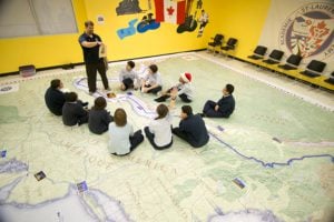
Giant floor maps put students on the map
Canadian Geographic Education’s series of giant floor maps gives students a colossal dose of cartography and is a powerful teaching tool
- 1487 words
- 6 minutes
Mapping
Precision is a value held dear by cartographers. We are a detail-oriented lot, and we take pride in the accuracy of our work. But despite the endless stream of satellites taking pictures of the planet with centimetre accuracy, and despite the terabytes of computational power at our disposal, the work of today’s map makers is filled with small imprecisions. The data we work with is always, to some degree, imprecise. This stems from the subjective decisions made in the process of delineating spatial data and turning it into maps.
Surely one of the simplest tasks you could ask a cartographer to perform is to calculate the area of a geographical feature. And seemingly the most straightforward areas to calculate would be those of islands. The definition is not in question — an island is a piece of land surrounded entirely by water. So it should be as easy as drawing a line around the island and using a mathematical calculation to determine its area. Simple.
Or maybe not. It is always part of the cartographer’s work-flow to classify and categorize the big messy world into orderly and comprehensible pieces of “data.” If we are to show cities and towns on a map as dots, we must first be able to define what these are. In this instance, we could define a city or town as a relatively dense area of human settlement that has a name. Easy enough. And though it is similarly easy to say that islands are pieces of land surrounded entirely by water, the tricky part lies in applying this definition to mapping data.
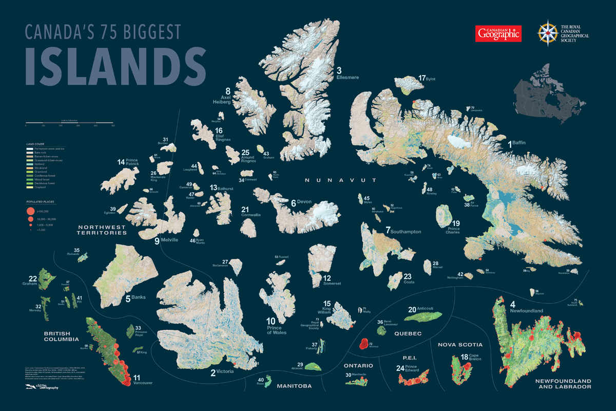
I learned this lesson when Canadian Geographic and my company, As the Crow Flies cARTography, teamed up to create a poster map of the 75 biggest islands in Canada (purchase it here). We had leaned on the Atlas of Canada’s list of the 40 or so largest islands when we published a big islands map in the September/October 2020 issue of the magazine, but no one seemed to have calculated the subsequent 35 islands, leading me to go directly to the map data to find them. When I did this I found islands that the Atlas of Canada hadn’t listed, and one of the islands that they included did not show up in my results.
The reason gets a little bit technical, but bare with me. Digital map data exists in three fundamental formats (see examples below): points, lines and areas (or polygons, as cartographers call them). Cities (at a certain scale) or business locations are captured as points; rivers and roads recorded as lines; and lakes, provinces and continents are stored as polygons.


Inversely, Ross Island just north of Manitoba’s Lake Winnipeg was missed by the Atlas of Canada (presumably for this same reason), but the data I was working with had it separated entirely from the mainland.
Now if finding the right islands can be tricky, deciding how big each one is, is truly fraught. The problems in determining a true and comparable area for each island are twofold. First, the cartographer has to wrangle a spherical Earth onto a two-dimensional plane (paper or computer screen). Second, the cartographer has to draw a precise line around the island, capturing all that is the island, and none of what isn’t the island, in the process.
The challenges of choosing the right map projection (or transformation from sphere to plane) are evidenced by the now vilified Mercator projection (below). You have likely seen this in countless online mapping applications — and it profoundly distorts the shape and area of landmasses as you get closer to the poles. Clearly not the map projection for comparing area (Greenland is not, as the Mercator projection would suggest, as big as Africa).

And while there are “equal area” projections that preserve a true relative area throughout a map (see example on right below), as I played with different equal area projections for this project, I realized that while they likely do preserve a relative equality, each one yields a slightly different absolute area on an island-by-island basis. Realizing this proves the impossibility of complete precision when calculating geographic area.

But surely, if an equal area projection yields comparable results, then at least we could successfully rank the islands by relative size. And we could, if only we didn’t have to accept that drawing the line around the island — the very heart of this exercise — is significantly more subjective and imprecise than one might think. This oldest of all cartographic exercises, putting pen to paper to trace a shoreline, has all of the pitfalls today that it did when explorers and colonists were busily drafting the shapes of the continents in the 16th and 17th centuries. Our instruments for collecting the raw data have improved immeasurably, but there remains a good deal of subjective decision making as the cartographer decides just where and how to draw the line between land and water.
Where to draw the line is simple enough for much of the shoreline, but becomes challenging when a large river on an island fans widely into a delta at its mouth. These are the ecotones of the cartographic world — the places that are two things at once, in this case river and ocean. And just where one ends and the other begins is in the hands of the cartographer and their “pen” as they draw this line. So, while the difference in area that will result from different choices here is very subtle, it is real, and will yield slightly different areal results. Greater differences still are latent in changing water levels, so as sea levels rise, or lake levels drop — an island grows or shrinks with every inch of water.
The core question about how to draw the line has to do with scale. As you zoom in closer to the Earth, more details are revealed. Little bays around an island that were not visible from 100 kilometres above the Earth are clear and present at 10 kilometres. Indeed, the complexity of the shoreline increases almost infinitely, as you get closer. Technically, you could get to the level of drawing around each pebble at the shoreline (for the truest true measure of the island’s size), adding waves and undulations to each metre of shoreline, and in so doing adding square centimetres of area with each jog. Clearly this level of detail is entirely unrealistic, but it proves the point that the scale you choose to draw the line at (see example below) has significant impacts on the final area calculated for the island.

For the poster of the 75 biggest islands in Canada, I used the most resolute map data available. In this case, I used Open Street Map‘s shorelines to define all marine islands. This data is open-source, and cobbled from many sources, but at its core, the scale it aims to achieve is that of streets and building footprints — so pretty darn detailed. Due to the challenge of acquiring this data for all freshwater islands, I used the Atlas of Canada 1:1,000,000 data to find large freshwater islands, then used the 1:50,000 data to calculate their area. My results were largely similar to what the Atlas of Canada had calculated some years back, but due to the very close sizes of the 7th, 8th and 9th largest islands, and due to the fact that I used (presumably) more detailed data to calculate their areas, I got different results.
So the poster of Canada’s 75 Biggest Islands that resulted from this work is highly defensible, and undoubtedly very close to correct. I certainly stand by it. But despite the certainty implied in the hard lines and distinct edges of any map, every map is more of an echo of reality than a crystalline and perfect reflection of it.
Are you passionate about Canadian geography?
You can support Canadian Geographic in 3 ways:
Kids
Canadian Geographic Education’s series of giant floor maps gives students a colossal dose of cartography and is a powerful teaching tool

Mapping
Maps have long played a critical role in video games, whether as the main user interface, a reference guide, or both. As games become more sophisticated, so too does the cartography that underpins them.
Mapping
Canadian Geographic cartographer Chris Brackley continues his exploration of how the world is charting the COVID-19 pandemic, this time looking at how artistic choices inform our reactions to different maps
Mapping
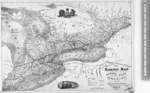
Early maps of the railways that shaped our country